

So.We Smart House
So.We is a mobile application that offers the users control and management of smart devices and the creation of automated routines for their houses.
My role: As a UX/UI Designer, I was responsible for the creation of mid- and high-fidelity prototypes, and the research, design, and validation of a new feature: automated routines. The product already had an MVP version running which I was responsible for improving.
The context: The discovery process for this project was conducted in cooperation with the design team.
The team found that the target audience for the app. is young people that are proficient with technology and are deeply concerned about sustainability. Therefore, energy-saving and optimization of tasks are key factors for the product.
The persona below is a representation of this audience.

The process
The conception, creation, and validation of the "routine" functionality was conducted using the iterative process.
In other words, we constantly tested the changes with real users to validate design decisions in order to improve the overall user experience.

Roadmap
The roadmap below illustrates the steps we took for the conception to the final design of the feature "Routines":


We conducted a competitors analysis to understand exactly what we are doing right (or wrong) to create an effortless user experience and a product that people enjoy using.
We focused the analysis on automated routines only to better prospect usability issues.
What are the advantages of competitors analysis?

What have we found?


Following the competitor analysis, we conducted a brainstorming section.
The session`s objective was to improve what already worked well on our competitor`s product while exploring their weaknesses to create a product that would stand out.
The following points were prioritized to be worked on:


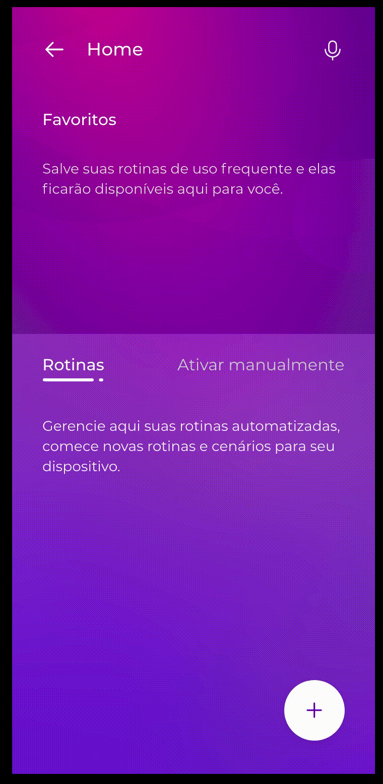
"Routine" flow and architecture
Firstly, we created a sitemap of how the "routines" feature would be structured, which served as a base to design mid-fidelity prototypes.

Mid-fidelity prototyping
Basic screens with the necessary information for users to create and configure automated routines were designed using the MVP`s components.
It allowed us to go from the conceptual stage to the implementation stage fast.
Advantages of using mid-fidelity prototypes

Mid-fidelity prototype schematics

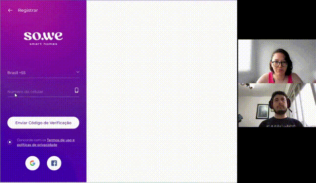
Usability testing
We tested our design and the proposed solutions with users that matched the persona.
Five users were subjected to conduct five tasks to verify if the app was easy to navigate and if the tasks could be completed with ease.
What have we found?
The usability sessions provided us with many interesting insights into how to improve our product regarding usability and easiness.
![SOPRANO - Teste de Usabilidade [ROTINA].jpg](https://static.wixstatic.com/media/6e20b9_e2c0b287a1a348459cbaa426048226b7~mv2.jpg/v1/fill/w_754,h_325,al_c,q_80,usm_0.66_1.00_0.01,enc_avif,quality_auto/SOPRANO%20-%20Teste%20de%20Usabilidade%20%5BROTINA%5D.jpg)
Due to the amount of information gathered during the tests, we created an affinity map to help us access the recurrent and more important issues to be worked on.

Further, a 2x2 Matrix (Effort X Impact) was created to help us prioritize which issues we should take action on more urgently than others:

What should we work on?
Most of the solutions proposed after the competitive analysis brainstorm worked well, however, new issues arose.
We conducted another brainstorming session where we applied the "How Might We" technique to come up with validatable solutions for the problems we encountered.
Below are the main issues found and what we came up with as how to address them:


Since words and icons weren`t intuitive enough to the users, we decided to run a survey to access the mind map of our users:


Among the questions, we presented descriptions of the routine functionality and asked what term better represents it. Additionally, we offered several icons and enquired which one best fits the functionality.
What have we found?
We clarified some demographics and user expertise with smart devices and general tech, however, the most important insights were the following:


The solutions we came upon in previous steps were prototyped in high-fidelity:

New Home screen
Routine feature tutorial
A new set of usability tests validated most of our solutions, increasing the completion rate of the tasks given to users drastically:


After some final tweaks, design version 1 was considered closed for development.
The next steps are the introduction of new features and monitorization of data and reviews that users leave on Google Play and Apple Store.
What have I learned?
The most valuable lesson I`ve got from working on this project was the importance of constant validation, especially through usability testing.
This dynamic helps elucidate how users will interact with your product and brings light to potential usability issues.
I consider the conduction of usability tests one of the most important UX practices when either before launching a new feature or to evaluate issues of features already in use.

Click below to navigate the interactive prototypes:
Download So.We Smart Home on Google Play and Apple Store: